Responsive Web Design: An Interview with Matthias Labsch
I've been seeing Web-Comics do a lot of "guest strips" for each other, and I usually like them. That gave me the idea, that I'd like to do a similar type of cooperation with developers. I've known Matthias for a few years, and so I talked to him about it. He doesn't have a lot of time, so we came up with the idea of an interview: maximum information for minimum time on his part. Responsive Web Design is a hot topic and relevant to both blogging software (covered) and Apps (I want to cover). So, I interview, I slap on some pictures and references. Voila!
Tell me a little about yourself, what you do and where you work.

So, my name is Matthias Labsch, I am a 34 year old front-end developer living in Freiburg, Germany. Currently I am working for a small marketing agency where I am responsible for front-end development using HTML 5, CSS 3 and AJAX on a WordPress basis. My main focus is Responsive Web Design and Accessibility.
Is there a special reason for the focus on accessibility? Your target customer?
During my work in several companies, it crossed my mind that most of the techniques I used for valid HTML pages and Responsive Web Design (RWD) are also a step closer to accessible websites. To name an example:

If you're using a more specific <input type="number" /> instead of a simple <input type="text" /> (which also accepts numbers), you will greatly enhance the possibility of screen readers to tell the user what kind of information they are requested to enter. As a byproduct, mobile devices will use a customized keyboard (e. g. only numbers) to assist the user.
My own handicap* is just another reason to dive deeper into accessibility, as I am not dependent on special devices to use my computer or the internet. But while I am able to get my information from the internet very easily, I know many other people with disabilities who depend on assistive devices and techniques.
So, your target customer is not the reason - it's just plain good design to be accessible?
Exactly! My opinion is: if I can create an accessible website with a small effort, why shouldn't I? Most techniques for RWD are one step in this direction, so I am eager to go the next step as well. But there's still a lot to learn 😊
So, getting to the main theme: How would you define "Responsive Web Design"?
RWD is a collection of many techniques to enable a website to adapt to different viewports without changing its source code. The most important approaches are (in my humble opinion) Mobile First, Progressive Enhancement and a good content structure. On top of that developers have a wide range of techniques like fluid grids, responsive images and so on.
What are the basic principles of RWD?
Let's take the three approaches I mentioned before.
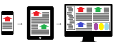
Mobile First is the concept where you develop your website and content so that mobile devices are favoured above desktop computers. This will force both the developer and the content engineer to emphasize the most important content first and create the source code accordingly.
This leads to the second approach, Progressive Enhancement. With Progressive Enhancement, you will enhance your content with more information and your website with more features, e. g. on your mobile device you will only see the websites header, the selected article and a footer. On a tablet, an additional sidebar will be visible and on a desktop computer you will see a fancy slider above the content. This way, your websites performance will be increased because you don't have to hide bandwidth-intensive features like the slider on mobile devices.

To achieve this, there are many good techniques and architectures. Many frameworks like Twitter Bootstrap or Foundation offer a wide range of features while architectures like ITCSS (Inverted Triangle architecture for CSS), OOCSS (Object Oriented CSS) or BEM (Block, Element, Modifier) will help you to organize your CSS.
"Graceful Degradation" is a decades old concept that applies to other engineering fields, too: when resources are limited, fall back to less resource intensive alternatives and/or leave things out. Is there a real practical difference between this and "Progressive Enhancement"? Or is it just a difference in where you start?
Both principles are legitimate and depend on your customer: if my customer wants to have a desktop-only website and decides later on that a mobile version is a must-have now, I would use Graceful Degradation - but with a huge cramp in my stomach. Experience shows at some point every customer wants to have a mobile version of their website. The reasons are manifold: bad Google ranking, user feedback, a change of mind and so on.
So for me, my preferred approach would be Progressive Enhancement. And as I said earlier: the code will be more performant. Just imagine that you can build up your CSS in a way that is cumulative, meaning the styles for the mobile viewport are loaded first, after that only changes for the next viewports are loaded because they enhance the code before. I do not want to condemn Graceful Degradation, but it's not my favoured approach.
So, you're saying there really is a practical difference: that (usually) large chunks of the website are loaded before being discarded in the graceful degradation approach?
Is that a fair paraphrasing?
Of course! Normally, you will have one CSS file (independent of whether you're using a CSS precompiler or not), so with Graceful Degradation you will find the source for e. g. the slider near the top of the file - which is loaded by a mobile device, but not executed. The mobile device now has to crawl its way down to the breakpoint responsible for its viewport and "forget" the loaded code.
Way better: load the code for the mobile viewport first and then ignore the following code because it is code for another viewport.
So, tell me a little about some of these terms you've mentioned. What about "responsive images"?

Regarding images, one major problem of RWD is: how to deal with images? It is possible to scale images, of course, but this is not the best solution in terms of performance.
One solution could be srcset, where you define multiple sources of an image within the srcset attribute in relation to a given viewport to display images of different quality in the viewport. A step further away is picturefill, where you are using the <picture> element to display different images within the changing viewports. This enhances the possibilities of srcset with the option of "art direction": you can use other images with their own srcset to e. g. display just one prominent tree (in mobile viewport) while you display the whole forest on desktop.
Regarding responsive images: if you want to have further information, this is a good article (German): "Responsive Images" at the blog "Kulturbanause". Google translation of same.
And "fluid grids"? Is that anything like CSS3 flexible box?
Here is a link to some examples: Fluid Grid examples from Twitter Bootstrap
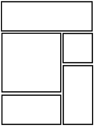
It's the most beautiful way to distribute your columns, because you can say it doesn't make sense to display a 25% width column on a mobile viewport, so I will use my breakpoints to say that on a mobile viewport, every column is 100% width and my information is stacked on each other. Then I can distribute my columns in the way I want to. This is a slightly advanced usage of fluid grids, but mainly fluid grids means you have a percentage value for your columns and thus you're able to have this very fluid design as you can see here.
One of the major uses of columns is to get things next to each other horizontally. This kind of stacking one over the other doesn't allow the user to move horizontally in a mobile viewport as he would on a desktop. Like with a table, where you want to be able to look at adjacent elements both horizontally and vertically. How yould you do that?
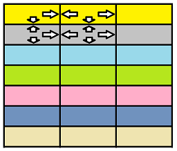
There are several solutions. I cannot explain them in detail, because I have to look it up. But there's a project called Responsive Patterns library, and they have different solutions for that problem. One solution would be that you use colors so that you can tell which row you are in when scrolling. Or you can make use of "data tables", a JavaScript library which allows you to sort your table and filter your table and so forth. In some cases you might want to display your table as a pie chart or other chart in general.
<picture> is HTML5, and picturefill, if I'm rightly informed, is even more cutting edge. Do you run into problems with browser support?
<picture> is not supported by old IE browsers, picturefill is a JavaScript polyfill library to enhance these browsers with the new element. If you need further information which browsers are supporting the <picture> element, have a look at "Can I Use"
So if you're looking for "picture" you will see that IE Edge will support <picture>, but none of the older versions of IE. picturefill.js will enable <picture> support down to IE 8 as far as I know ...
It looks like people stuck with an old Android Browser are also out of luck.
Is that an issue for you or your customers?

Not really because most of our customers agreed on our recommendation to support the two latest versions of each browser, if the market share is significant.
A good source for responsive workarounds: Responsive Patterns
What is "Adaptive Web Design" and how is it different than "Responsive"?
Uh, that's a tricky question because most techniques used for responsive design are also used for adaptive design 😄 I would say that adaptive design just distinguishes between viewports and loads a design just for that specific viewport while responsive design tries to fit in the marginal differences between the devices. As an example: adaptive design will provide a 320 px wide design for all mobile devices while responsive design is able to cope with slight width differences between Android and iPhone versions.
Or simplified: adaptive design is a lazy version of responsive design because it just shows one design for a bunch of device viewports 😄
When should I not care about Responsive Web Design?
When it is clear for you and your customer that they will not have a mobile version of their website, e. g. when the website will run in an intranet exclusively.
Another reason could be the costs for a mobile version.
You were talking about accessibility earlier - do you support blind users who might be using a text-only browser, such as lynx?
Conversely, do you have any recommendation for a blind user?

To answer your first question: I would hide certain areas of my content with display: none and mark it with ARIA labels so that the screen reader will ignore it.
Unfortunately, I never used a screen reader for testing, so I cannot give any recommendations. But I think I will due to the blindness of my aunt and a friend of mine.
A lot of interactive services are now in both Web and App form, such as facebook and memrise. Do you have any comments on this trend?
(I suspect they do this, because they find RWD too hard)
The more I am using Facebook and YouTube on my smartphone, the more I like the responsive browser versions - simply because I can use an ad blocker there to get rid off these bloody adverts 😄
😊
Most web sites these days are based on some CMS framework:
WordPress, Joomla, Drupal, et al.
Do some of them support Responsive Web Design better than others?
What should I look for in a CMS?
I am unfortunately not familiar with Drupal or Joomla, but the latest update of WordPress introduced built-in support for responsive images (via srcset).
Another important thing should be that the CMS is able to use themes (which can be responsive then) and that it should be possible to minimize and concat source files for CSS and JS. This is not directly related to RWD, but is a sideshow regarding performance (which is a must-have when we are talking about RWD).
Okay. Conversely, any advice for experienced programmers looking to do things themselves?
What further articles, books, or other resources do you recommend?
Any particular authors/bloggers?
Okay, if you want to start as an experienced developer you should get familiar with the basic principles of Mobile First, Progressive Enhancement and Content Choreography. Next, try to study common principles (fluid grid, responsive images, forms) by looking at a CSS framework like Twitter Bootstrap and then looking up the principles used there by reading the articles of some very awesome front-end evangelists, e. g. Brad Frost, Luke Wroblewski, Ethan Marcotte or Andy Clarke. While reading their articles, you will automatically stumble over more interesting topics which will help to improve your (responsive) web design: Atomic Design, Responsive Design Pattern and so on.
For general information and inspiration, please have a look at Smashing Magazine - it's the largest and most well-known magazine about web development. And they are based in Freiburg, too! 😊 And last but not least, ask me or have a look at my website, Dev On Wheels 😉
Thank you very much! 😊
You're welcome! That was fun! 😊
Lessons 
- Interviews are fun!
- There's always more to learn.
Resources 
- Twitter Bootstrap (home)
Bootstrap Resources
Fluid Grid Examples - Zurb Foundation
- ITCSS (Inverted Triangle architecture for CSS) - Explanatory article at Creative Bloq
itcss.io - which leads to the ITCSS twitter feed
The ITCSS Primer article (at Net Magazine or elsewhere) appears to be missing. - OOCSS (Object Oriented CSS)
- BEM (Block, Element, Modifier)
- Blog "Kulturbanause" (German language)
Article "Responsive Images" / Google translation - Responsive Patterns
- "Can I use" - enter a feature and see which browser versions support the feature and what percentage of users are covered.
- Brad Frost's blog
- Luke Wroblewski's website
- Ethan Marcotte's website
- Andy Clarke's Podcast, "Unfinished Business"
- Smashing Magazine
- Matthias Labsch's website "Dev On Wheels"
Footnotes 
*Matthias has a rare form of muscular dystrophy
Copyright © 2016 William David Herndon. All rights reserved.